Branding
People First is promoted as part of the One MHR package, this means whilst we use logos and branding for People First we also promote MHR as the power behind the product.
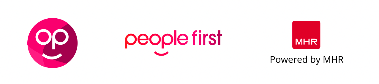
These are the main elements of our branding. The People First face logo, the People First written logo and the 'Powered by MHR' stamp.
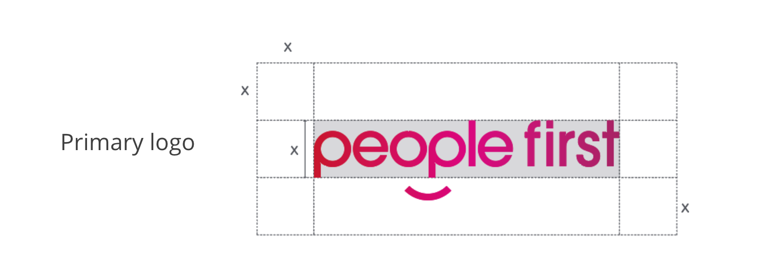
The exclusion zone
The Exclusion Zone ensures the legibility and impact of the logo by isolating it from competing visual elements such as text and supporting graphics. This zone should be considered as the absolute minimum safe distance, in most cases the logo should be given even more room to breathe. The Exclusion Zone is equal to the height of the word mark (marked as × in the diagram).
Minimum sizes
Establishing a minimum size ensures that the impact and legibility of the logo is not compromised in application. Due to the higher resolution available in print vs. that of screen-based media (300dpi vs. 72dpi respectively), we are able to reproduce the logo at a fractionally smaller size in print without any graphic deterioration.
Digital - To ensure legibility and impact, the logo should never be reproduced smaller than 90px in any digital communication.
Print - To ensure legibility and impact, the logo should never be reproduced smaller than 18mm in any print communication.

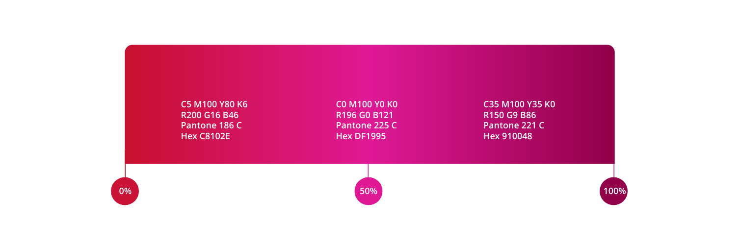
People First gradient
From our core colours, we have made a palette of bold, bright gradients that represent the interactivity, movement and flexibility of our product.
Gradients have stand out and feel much more interactive and digital than flat colour, and we use gradients in our brand wherever possible. There may be times that gradients are unable to be used, or flat colour works much better on things like small icons. In these instances, we use an appropriate colour from our ten-core brand colours.