Buttons
Buttons in People First have many variants, these variants can be viewed on storybook here
Font style
Colour of text depends on the button colour, generally white text on dark coloured buttons and grey slate text on light buttons. Contrast should be at least AA.

Spacing
Buttons should be ordered with the main action on the left and the secondary action on the right with a spacing as shown below
Button rules
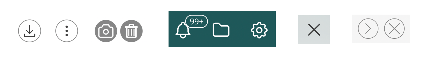
Icon buttons
Buttons don't always contain text, actions that are commonly used such as 'edit' 'add' 'delete' 'download' 'close' can be shown as an icon as this is easily recognised by users.
These icons either sit in a hollow circle or on their own. Use the icon in a circle if you want the action to stand out more.
Examples
Hover states

Accessibility
Because these buttons don't have a written action they need to be marked up correctly for screen reader users and to help sighted users have a better understanding of their function. Icons accompanied by text do not need title text and can be hidden from a screen reader.
It is important to label these buttons with title text, shown below is an example of how this should be done correctly: